Table of Contents
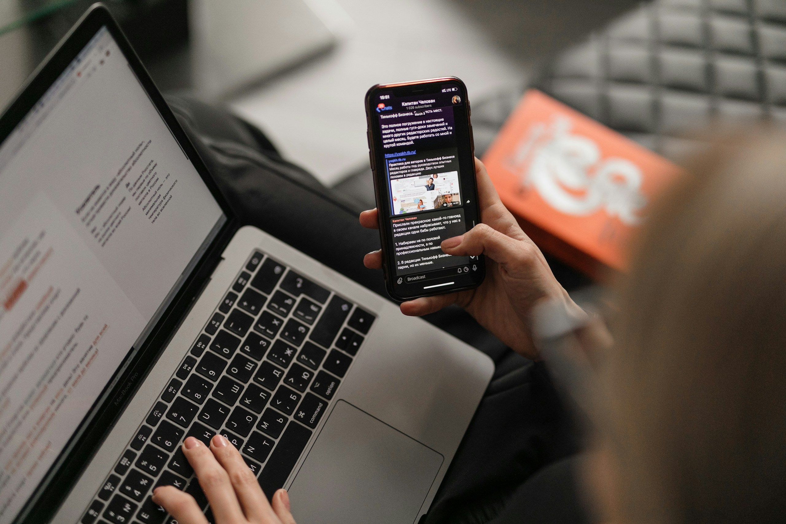
More than 70% of email opens now occur on mobile devices, making mobile-first design a necessity in 2025. Consumers expect fast-loading, thumb-friendly experiences that look and function seamlessly on smartphones and tablets. Without it, even the most compelling campaigns risk being deleted within seconds.
At Apeiros Marketing, we prioritize mobile-first design as a foundation for every email campaign, ensuring clients connect effectively with audiences wherever they are.
Why Mobile-First Design is Essential
Today’s audiences live on their phones. From checking promotions during commutes to browsing newsletters over coffee, mobile devices dominate email engagement. If your emails don’t display properly, subscribers won’t waste time pinching, zooming, or scrolling awkwardly – they’ll simply hit delete.
The Business Case
Studies consistently show that mobile-optimized emails achieve higher click-through and conversion rates. A poor mobile experience not only hurts performance but also damages brand perception.
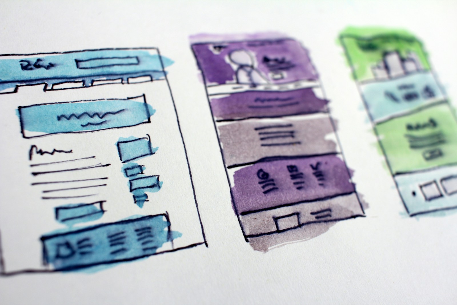
Key Elements of Mobile-First Email Design
Designing for mobile requires more than responsive templates. It demands a thoughtful approach that considers usability, speed, and accessibility.
Core Best Practices
- Responsive Layouts: Ensure content adjusts to any screen size.
- Thumb-Friendly CTAs: Large, tappable buttons reduce friction.
- Concise Copy: Short, scannable text works best for mobile readers.
- Optimized Images: Compressed visuals prevent slow load times.
- Single-Column Design: Keeps layouts clean and easy to navigate.
These elements make emails faster, easier, and more enjoyable to interact with.
Accessibility and Inclusive Design
Mobile-first design also intersects with accessibility. High contrast, alt text, and scalable fonts ensure emails are usable for all audiences, including those relying on assistive technologies.
Accessibility isn’t just ethical – it’s increasingly a compliance requirement under laws like the European Accessibility Act and ADA guidelines. For reference, the U.S. Department of Justice ADA resources provide guidance on accessibility best practices.
Why It Matters
Inclusive design expands your audience reach and reinforces brand trust. It shows a commitment to valuing every subscriber.
Enhancing Engagement with Mobile-First Emails
Optimized mobile experiences directly impact campaign performance. Clear CTAs, streamlined layouts, and personalized content increase interaction, while slow-loading or cluttered emails drive unsubscribes.
Example in Practice
An e-commerce retailer using thumb-friendly CTAs and single-column layouts sees more conversions compared to complex, desktop-centric designs. Mobile-first design directly influences sales.
FAQs About Mobile-First Email Design
What does mobile-first mean in email marketing?
Are responsive templates enough?
How do thumb-friendly CTAs improve engagement?
Does mobile-first design impact deliverability?
How can small businesses implement mobile-first design?
Final Thoughts
Mobile-first email design is no longer optional – it’s the standard in 2025. Brands that fail to optimize for mobile will lose engagement, revenue, and credibility.
At Apeiros Marketing, we build campaigns designed for the way audiences live and engage today. By prioritizing speed, usability, and accessibility, we ensure our clients’ emails deliver maximum impact in the inbox and beyond.
